

The Journey to Refresh the Client Look
What is Mission Minded?
Mission Minded is a branding and marketing agency that works exclusively with non-profit. They believe in the work of non-profit organizations and want to help them create the impact and receive the recognition they deserve. Hence the name Mission Minded.

We have received the honor to work with Mission Minded in helping them re-design the website in order to help the clients in using the website and understand better about Mission Minded. Alongside, a proper website would attract more traffic and can help Mission Minded reach its business goal as well.
Our team includes Erika Aldeburgh, Mallory Michaelis, and me.
My role:
In this project, I leaned heavily on Google analytic research in synthesizing the meaning behind the website traffic data in order to help the new design of the website can both reach out easily to potential clients and help the business meet its goals. Additionally, I performed note-taking in interviewing with clients, create persona templates, design the website wireframe and mock-up of various components.
Research
User interviews

Mission Minded was great in helping us gathering interviewees to conduct research for the website. The interviewees were both former and prospective clients. We interviewed via phone calls and took note of their responses. From the information that we gather, we performed affinity mapping and creating prospective personas.
Also, thanks to this opportunity, we learned how important and helpful is it to have different points of view of the user previous experiences as well as the future expectations for the product.
User interview can help us create a product that not only can improve its current state but also push it to the direction that it should be.
Affinity mapping

From the interview notes, we performed affinity mapping and found certain themes to be repetitive:
- "I like that Mission Minded only works with non-profit."
- "I want to know what kinds of service does Mission Minded provides."
- "I want to see whom Mission Minded worked with.
- "Mission Minded understands what we're trying to accomplish."
With the themes mapped out, we proceeded to create personas and their prospective use-flows base on their needs and behaviors.
Personas


The personas compose of 3 prospective users:
- Ben: fresh in the field, he needs help with branding.
- Mary: knows Mission Minded through her social circle, she wants to give a try with it.
- Mackenzie: believe in the non-profit calling, she wants to be a part of the Mission Minded team.
These personas were done beautifully mostly thanks to Mallory.
User journey
Along with the personas, the user journey helps us walk through the emotional journey of the users as they use the website. From it, we can understand the good points as well as the struggles that users have to face when they use the website so we know where to improve the use-flow.

Information architecture
Card sorting
To help us determine which features should be used and how to group them, we performed cart sorting, started with open-sorting and close-sorting later.


With the personas created along with the use-flow for each of them and the result from card sorting, we proceeded to make the sitemap.
Sitemap

This is the basic sitemap for the website based on the use-flow of the personas we created. However, we reached out further and performed business competitive comparison and data analysis of the website traffic data from Google Analytic.
Google analytic
Business competitive comparison chart was really helpful as it guided us in creating the website with practical and necessary features that many similar companies have while avoiding needless functions that we might think valuable.

I was responsible for the data analysis and synthesizing the website traffic data from Google Analytic. Personally, this was a great opportunity for me to step my foot in the research area of UX design. In this practice, I was able to learn to understand the meaning behind the traffic data - the number of times each page of the website is visited - and figure what I can do with it in sharpening the new design.
It's not about getting the numbers.
It's about understanding and figure out what you can do with them.
The donut-chart below summarizes the statistic of the most popular pages of the website and from that, we can learn the meaning behind the data and figure out what to do with them.

Due to confidentiality, I cannot show the specific data chart of the pages.
This donut chart still shows the basic meaning of the numbers that I collected and synthesized.
The chart was done beautifully by Erika.
For example, one of the most popular pages of the website is the homepage. This is pretty much given and there is nothing to discuss.
However, the second most visited page is a blog post about how to increase your blog popularity. But it also has a high bounce rate, meaning the visitors usually leave right away after reading the page. From this situation, I can understand and analyze what keywords or topics that users search for and increase the appearance of them on different pages. Also, I can incorporate it in a way that can make it become the lead page to the homepage. That means after reading the page, visitors can click on other links to find more beneficial information for their business and eventually to the Mission Minded homepage.

This is the most visited page after the homepage. Typically, people find this post valuable, thus explains its popularity.
However, they are likely to leave the page after finishing without visiting Mission Minded website itself.

In this case, we can include leading link to the homepage or other relevant pages by adding the web link within the post.
For example, here we can add a link says "Why I believe in children?" and lead the users to another page.
This will induce reader interest and can lead to more traffic to the website.
Another example is a page called "Testimonial." Basically, it's a page of previous client reviews and talked about how they enjoy working with Mission Minded. This "Testimonial" page was one of the main tabs in the home page because Mission Minded believes that it would create a sense of trust for the prospective clients.
However, based on Google Analytic traffic data, this page view-count in total only makes up of 0.08% out of the whole website, meaning the page is only seen 8 times out of 10,000 (the rest 9,992 is distributed for other pages).
So is it really necessary to have a page just for the reviews from the clients?

In this case, the answer is NO.
However, it is necessary to have the reviews for the visitors to see. So we extracted quotes from the "Testimonial" page and distributed properly on different pages. For example, one of the companies that Mission Minded worked with is Company A, so we decided to include the quotes from Company A on its case so visitors can see the review from the company right where it should be.
Another thing is we include the most popular companies testimonials in a small section on the homepage so visitors can also see them when they visit the website.

Having the testimonial statement on the portfolio page makes more sense than having a tab for itself on the homepage, especially the view-count percentage is too low.
Since Mission Minded still wants to have the page, we decided to move it into a different category - the portfolio page. The "Testimonial" page now is included in the portfolio section instead of having a tab for itself in the homepage.
Having good reviews is important.
Knowing how to show them
matters even more.
Wireframing


Sketches

.png)
Mission Minded wanted to have a homepage that has a welcoming and big hero image. With that request, we were inspired by the sample on the left, having the hero image on top with the descriptive test in front.

%202.png)
Next, we studied the design of another website to learn how to feature Mission Minded previous clients on the homepage.

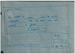
Mission Minded wants to create a chat with visitors in a warm tone, so we created a message box at the end of the page.

By using "Let's talk", it shows the initiation from Mission Minded instead of, technically, "asking" the visitors to "start a conversation."
This way, if visitors finish viewing the whole page already, they don't have to look up and find the "Contact us" box.
Wireframes

Since Erika and I were responsible for wireframing (and Mallory joined in later as well), each of us came up with our own design and review together to figure out which one would be the best or what kind of features that should be used.
Erika's design

My design

How would you include a functionality that will always appear on the user interface?
The answer: sticky feature.

With the idea of including a chat initiation feature, I included the chat box. This box will be "sticky" at this position, meaning visitors can scroll down the web page and the box would still appear at the same position.
However, upon usability testing, the sticky box appears to be causing inconveniences to the users as its movement on the screen distracts the users from using the website.
Therefore, the sticky box feature was removed from the design.
Not only the design should function well
but also needs to have a pleasant look.
Another problem arose in my design is that the wireframe is beautiful in visual, but when it comes to high fidelity mockup, it could not stay up to its potential.

The slanted boxes give an aesthetic and artistic look for the sample client photos.
Yet do not look the same with real pictures. Not only the "Sample Client" box is blocking a part of the picture but the slant cuts off a part of it also.

Though my design was well received in the beginning, a lot of it was not made into the final design. To me, I cannot help but feel upset and frustrated. The fact that it was not included in the final design was not the big part though for I understand that my design cannot always be the best one. But the fact that the wireframes, seemingly visually delightful, cannot become what it is supposed to be made me feel disappointed.
I felt as my effort was good for nothing,
and I was on the wrong track.
I felt as I let my team down.
But,
I do not let that put me down.
I learn to accept the reality and be more humble. For, in the end, we are a team, and we figure out the answer together. It is not about whose design is the answer but ultimately can we find the design solution.
As long as we can find the answer, the mission is accomplished.
Mockup
After we review our wireframes, we moved on to upgrading the wireframes into high fidelity mockups.


From usability testing, our users gave us their feedback on text size, word choice, etc.
For example, our initial text size for the "Mission Minded" was typed in size 48. In Sketch, since the screen was smaller, it did not seem to be a problem. But when the design was projected into a normal computer screen, the size turned out to be really big and did not look good.

.png)
Another thing is Mission Minded wanted to use warm and welcoming language as much as possible, so we change the choice of word from "Blog" to "What we're thinking." This choice was well received from both the Mission Minded team as well as our testing users. They all thought that the word choice really brought out the friendly atmosphere for the site.
Color research, design, and its psychological impact
One of my design tasks was to create the footer for the website. At first, I only use black and white, or grey scale, for simplicity. But Mission Minded wanted a warm tone, so I moved on and give it a try with orange. To my surprise, as I changed the shade of orange, it gave a different feeling to each design along with it clarity in visual (the right text vs. text box color difference can improve readability or become gaudy).

Also, I got to experience the research on color and its impact. For example, red can bring the boldness feeling to the viewers, but can also mean a warning. Then I remember that blue is also a color of the Mission Minded logo. Psychologically, the color blue also creates a sense of trust. So I thought about it and gave another try to the footer.
Little did I know, I was right.
Mission Minded chose blue to be the color of their current footer.

Final thoughts
Being a part of the design team for Mission Minded was a great experience.
Not only it taught me to be humble and respectful, but I also learn to accept myself and become more confident in my skills. I thought that my initial design would make it to the final for it looked great in "practice." But the "performance" did not go as well as it should. Still, the point is not about whose design get the most credit. The design team is a team, and our goal is at the end of the day, together, we can find the solutions to the problems, the answers to the questions, the right design.
Another that I learn is not to doubt myself, always be creative, always give it a try even though if it seems irrational or out of nowhere, and be confident with it. My random try on color research turns out to be important, to me at least and made it in the final design. This tells me that no matter how small is the design, if it is important, it is important. And I should learn to appreciate my design and effort.
One last thing, this experience opens the door for my research path as I learn how to use Google analytic. This is a huge confidence boost for me. I grew up in Asia and studied math since I was really young, along with my experience in scientific research from my college years for a Biology degree, I have gained so much experience in statistics, calculation, data research, analysis, and synthesis. Yet I have not found a way to make use of those skills.
Thanks to this opportunity, I have finally found my calling: to perform research and design products that can be useful to the users and can also meet the business goals of the clients.
To view the current Mission Minded prototype, click on the logo below.

Visit the current Mission Minded website at https://mission-minded.com/
Or visit Erika's website: https://www.ealdeborgh.com/
and Mallory's website: https://www.mallorymichaelis.me/