

The story
Instagram Marketplace is an Instagram feature that allows users to finish the purchase within the Instagram app itself without leaving the site while having a seamless design. Upon our initial approach, our mission was to help Instagram generate revenue by allowing users to print their favorite pictures from Instagram on canvas and payment will be made for the artists or owners of the pictures.

However, after our research we’ve found that users are not into purchasing canvases from Instagram but rather want to purchase products on the advertisements they see on the app. Furthermore, Instagram is a photo sharing app; it is our mission to create an e-commerce feature without losing the uniqueness of it.
And Instagram Marketplace is the feature that will solve the problem by allowing users to search for their favorite products from their own curative list and creating a smooth transaction process without hindering the authenticity and familiar user flow.


The Challenge
“Creating a revenue stream for artists and photographers on Instagram and the company.”
However, upon researching, it turned out buying picture canvases online from Instagram was not really something the users wanted. The "challenge" became an undesirable goal. But it gave rise to a new challenge:
"To allow the users to purchase their favorite items from their own curated list within Instagram."
My role

Competitive research

User analysis

Wireframing

Create sitemap

Design user flow
Problem
Instagram contains ads from brands; this becomes unpleasant to users for losing the authenticity of the photo sharing app.
Users cannot purchase products without exiting the app; this creates usage friction and stops the purchase flow.


So here we have an app, originally is a photo sharing app, that is now flooded with unwanted content: ads from brands and businesses that the users don’t want to see. And even if they like the products, users can’t purchase them conveniently.
The Journey

Research
By understanding that researching is one of the most important parts of designing an experience, we focused heavily on understanding our users, what they need, how to improve it, etc. and tried to create the most practical and correct solution while keeping the aesthetic look of the app.
Initially, this was not one of my assignments but I somehow picked it up along the way and conducted a couple of interviews myself for the research. I was sitting in a coffee shop and just started asking people around me for the interview. Thanks to this incident, I found out that I can perform well in research areas. Also, it was a boost to my confidence as it showed me that I can take things on the fly and still perform effectively.

Analyze
After gathering information, the next step is to understand them. With the data and answers we collected, we began analyzing and put them into ways that make sense to us in order to analyze and define.
First, we tried to analyze the information that we got from researching of competitive apps such as Shutterfly, Overstock, etc. to figure out how they perform in the picture and canvas business. We also research on the market and Instagram itself to know what is the current need and supply information of the app.
In this part, I specifically performed the research of the purchase flow set up and some of the features that a picture business website might need, such as what is necessary in setting up the purchase, what kind of information needed to process the payment and shipping, option to edit the shopper information, etc.
And in order to do so, our process involved:

Affinity mapping

Card sorting

Usability testing
Usability testing
Along with card sorting and affinity mapping, we performed the usability testing of the current app itself during the research process. The team tested the use flow and learned how to incorporate the new function. With the current situation, we decided to use the current flow and only make some adjustments that would not change the layout too much since it can ruin the authenticity of the app.

Card sorting

With card sorting, we tried to map out the site usage, its road map and functions, and grouped them together into themes and topics. We performed the grouping activity ourselves and with the helps of our pears. It started with “open sort” which was to freely group the topics and then assign their themes, then onto “close sort” which is to use the themes we just found and see if the cards still somewhat fall into those categories. The result was to understand how the new function should align with the design of the app without interfering with its original use-flow and the look of the app.

Affinity mapping

From our interview answers, we put them into sticky note with different colors indicated different interviewees. We then grouped the answers that convey similar ideas and created a theme for each group. From this, we can understand what were the major setback and issues that the users have. By doing so, we can figure out what areas that need improvements and changes.
Define
Now this is an interesting part. Upon research, we’ve discovered that the initial topic actually was not relevant. Apparently, users neither do not want to purchase canvas from Instagram since they rather buy them from craft stores or online, or they can just find the pictures and print out themselves. Thus, the topic of creating a function that allows Instagram users to purchase canvases and pictures that they see on the app became impractical since it will not be able to generate revenue for Instagram and its users.

When we interviewed the users outside of the idea of buying canvases from Instagram, the questions were about their usage and thinking of the app, what other factors do they want to have in the app, etc. With the answers we found, we’ve encounter with a different, yet exciting topic, for it can create even more revenue and benefits for Instagram as well as the users, brands, and influencers. It was to allow users to purchase and check out within the app without the need of jumping into the host or brand websites.

With this discovery, we can see further why researching is so important in the designing process:
To understand the real problems and create correct solutions for it.
This helps us avoid creating something new because we think it might be helpful but it is not what the users are looking for.

Now that there’s a new plan, we iterated the process of interviewing, affinity mapping, cart sorting, and usability testing again for this new topic.

Solution
Design a new seamless layout without making the users feel displeasing; keep the original touch of the app.
Create a feature that allow users to finish the purchase within the app; design a smooth checkout flow.


Ideate
Now that we’ve found our solution for the defined problem statement, the next step is to ideate: to create, test, and iterate the solution design. Our process included:

Persona


Prototype
Information architecture

Wireframing

Testing

Iterate
Persona
Creating persona is a step that allows us to map out a potential user flow. By creating prominent users and understand their behaviors, we can design potential scenarios, predict the way the users would react and behave, then adjust the use flow appropriately.


Based on our finding, we collaborate and created 3 most prominent personas for the new feature. Thanks to that, we narrow our focus and design the feature that meets the expectations of the users.

The first persona maps out one of the most basic functions for the app shopping feature: to search for products from scratch.
This persona serves as a user who would go on Instagram and search for his or her desire products using the search bar. From this point, there would be new features that involve in the search process, such as filter function, search history, previously viewed products, etc.
The second persona is an example of users who look for products that are shown by their favorite influencers.
When the influencers show something that they use, it can be seen as they are advertising for the products as well as showing the product review. By doing this, influencers create a sense of trust to their followers, the users who follow them, and make them interested in the products.


The third persona is also a major player for this function: the influencers - people and brands that want to generate revenue from their products through Instagram.
This persona puts advertisements of products on Instagram. Mostly these influencers will market the products and will receive affiliate payment. As for brands, they will be able to put their products on Instagram and allow users to purchase within the app.
This persona is quite complicated and will have its user-flow in the future.
Journey map
With the personas created, the next part is to draw out a journey map: the emotions and feelings that a user can feel during the use flow from beginning to finish. By looking at the emotions of the users, we can find out the areas of use that need changes or improvements for the experience.

Information architecture
Information architecture can be understood as the blueprint for the design structure. With it, we can develop and create the design that based off of the information into sitemaps and wireframe.


Sitemap
After creating the personas, we started designing the potential paths for each persona and adjust the contents of their use flows to align with the design of Instagram. To do this, I designed the App map to understand the current use flow of the app.

Since the goal was to create a new function rather than creating a whole new app, we tried to add the feature seamlessly in the app without making the users feel unpleasant because of the changes.
From the sketch app map that I created, we proceeded to a more detailed and digital sitemap.
Joy was a huge support in this part.

User flow
Along with the app map, we developed the user flows for each persona (exclude the Influencer) to understand and design the flow of the app. The purpose of this step is to further dive into and design the use flow for each persona; with each step designed for each persona, we can oversee the whole flow and see if there were steps that we can add, eliminate, or combine with other flows for different personas.

With the user flow mapped out, we proceeded to create the wireframe.
Wireframing

Wireframing is a process of creating and designing possible solutions, mostly the layout of the screens for the websites or app and the interactions involve with the users. The process starts with simple paper sketches or whiteboard drawing, proceeds onto more detailed paper sketches, and then digital wireframe from low to high fidelity.
Sketches
Since we decided to modify the app layout instead of creating a whole new one, we sketched out the original layout of the app and then tried to add the new features.


With the whiteboard, we mapped out our most basic ideas. The points of this activity were to have a couple of quick sketches to discuss the designs and find new ideas during the communication part between teammates. As the board can be erased, we only used it for communicating purposes and then moved on to simple paper sketches that I made.

As the design would be more confirmed, simple paper sketches would keep the new designs in places and could be used again for future references. Also, the detail of the paper sketches increased as we were approaching high fidelity paper wireframes and prototypes.
After simple paper sketches finished, we moved on to even higher fidelity paper sketches with grid papers.
This part was done beautifully by Joy.


With the paper sketches done, we moved on to digital wireframes.
Digital wireframe
From the designs of the paper wireframes, we created our wireframe on Sketch with each screen for the new design and how the flow would be according to the user paths.


Aside from modifying the layout of the app, we also learned and tried to create a new design for the new feature as well: the check out flow. To do this, we studied a couple of e-commerce websites to find out how they design the flow. From that, we tried to create a design flow that can fit well with the theme of the app as well as making it convenient for the users to use. This part was done really well by Neil.


By learning about the essential elements of a product page, we were able to design the layout of the page for Instagram. We tried to keep it user-friendly, easy to use while still showing the necessary information about the products. Furthermore, we did not want to design a new e-commerce app, we were designing a new e-commerce feature for Instagram. It was essential to us to keep the theme within the checkout flow as well as the whole shopping experience.

Beside from the product detail page, we also learnt how to create a checkout page by visiting other shopping mobile apps to design the flow. Since we were designing something new, we took our chance and even kicked it up a notch by re-designing the checkout flow to make it even faster for users to do. To do so, we learnt from many other e-commerce apps such as Amazon, Target, Walmart, eBay, etc. to combine elements that we thought useful and designed them so it can maintain the Instagram “look.”


Prototype
With the low fidelity wireframes mapped out, we began putting in the details for the layout and created the high fidelity mockup. Instagram itself is a photo sharing app and we wanted to make it look amazing without changing too many details. By having actual pictures and color on the screen, we can see how the actual product would look like for the grey scale may not represent the whole experience.


We tried different approaches with colors and textiles. As we can see, the “Add to cart” button from the screen above uses the color blue, from researching, is the color that promotes “trust.”
However, with the screen below we wanted to be creative with the color choices and created the bar with the color scheme similar to the Instagram logo as we wanted to keep the Instagram theme throughout the experience.


With the new features being added, we changed the layout of the app in order to include the new elements that were needed to execute the new "shopping" function.
For the influencer page below, we now have a new “shopping bag” button that will filter and only include photos that feature products available for purchasing.


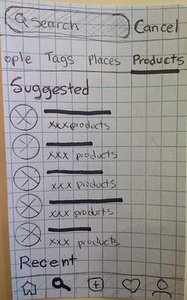
Not only that, users now are able to search for products from the “Search” page by tapping on the new “Product” tab in the submenu bar on the page as shown below.


Testing and Iterate
With the prototype finished, we tested it with some users and people in the class to help us improve the design and experience with the app. From our testing results, we took note of what details were well done and useful, and then modified those features that needed improvements.
One of our iteration results was the checkout flow.

Cart details

Payment

Shipping
With the testing results, we found out that users were confused with the “checking” bar on top signifying the steps that were done. They’d rather have it without the status checking bar.
Also, the “shipping” step at the end was not a good design for it can cause unpleasant feeling for users if they find out that they have to pay more because of the shipping cost; therefore we put the shipping step before the payment step.


Cart details
Payment
Shipping
This is just one of the iterative examples that we did. By doing this, we realized that usability testings and feedbacks are extremely crucial in the iterative process. To iterate is to "get out of the box" and look at the design from different perspectives, or to be more accurate: from the point of view of the actual users.
The Ending
With our product finalized, we present the Instagram Marketplace: a new feature on Instagram that allows users to purchase products from their curated list of the influencers they follow within the app. The new design is made to keep the authenticity as well as the aesthetic visual aspect of the app.


Final Thought
Instagram Marketplace is a great concept that is promised with a lot of potential for revenue growth for the users, brands, and the company itself. Though it is not official, the idea can definitely be put into good use and can become a big part of Instagram.
Personally, I enjoy this project and it helps me grow so much in product management, writing, editing, and work ethic. Although our team was great, I like this concept so much that I went on and expend the horizon myself. If the official opportunities to work and develop this idea arrive, I would totally dive in deeper and create the real product.
Click on the Instagram Marketplace icon below to view the prototype.
